Pulse Gym is a modern fitness center targeting individuals who value transformation, discipline, and high-performance training. Their original website was outdated,lacking visual impact, responsiveness, and any kind of content management system. It didn’t reflect the brand's intensity or appeal to their younger, fitness-focused audience.
frontend , ux/ui , static
Pulse Gym
Key Features
- Hero section with strong calls-to-action and motivational headlines
- Modular pricing plan layout with CMS-editable tiers
- Custom Decap CMS collections for team and gym features
- Fully responsive and mobile-optimized layout
- Semantic HTML, ARIA roles, and screen-reader support
- WebP images and lazy loading for speed
- Tailwind-powered visual system with symmetrical sectioning
- Built with Eleventy, hosted on Netlify
Role/Services
frontend , ux/ui , static
Date
Mar 6, 2024
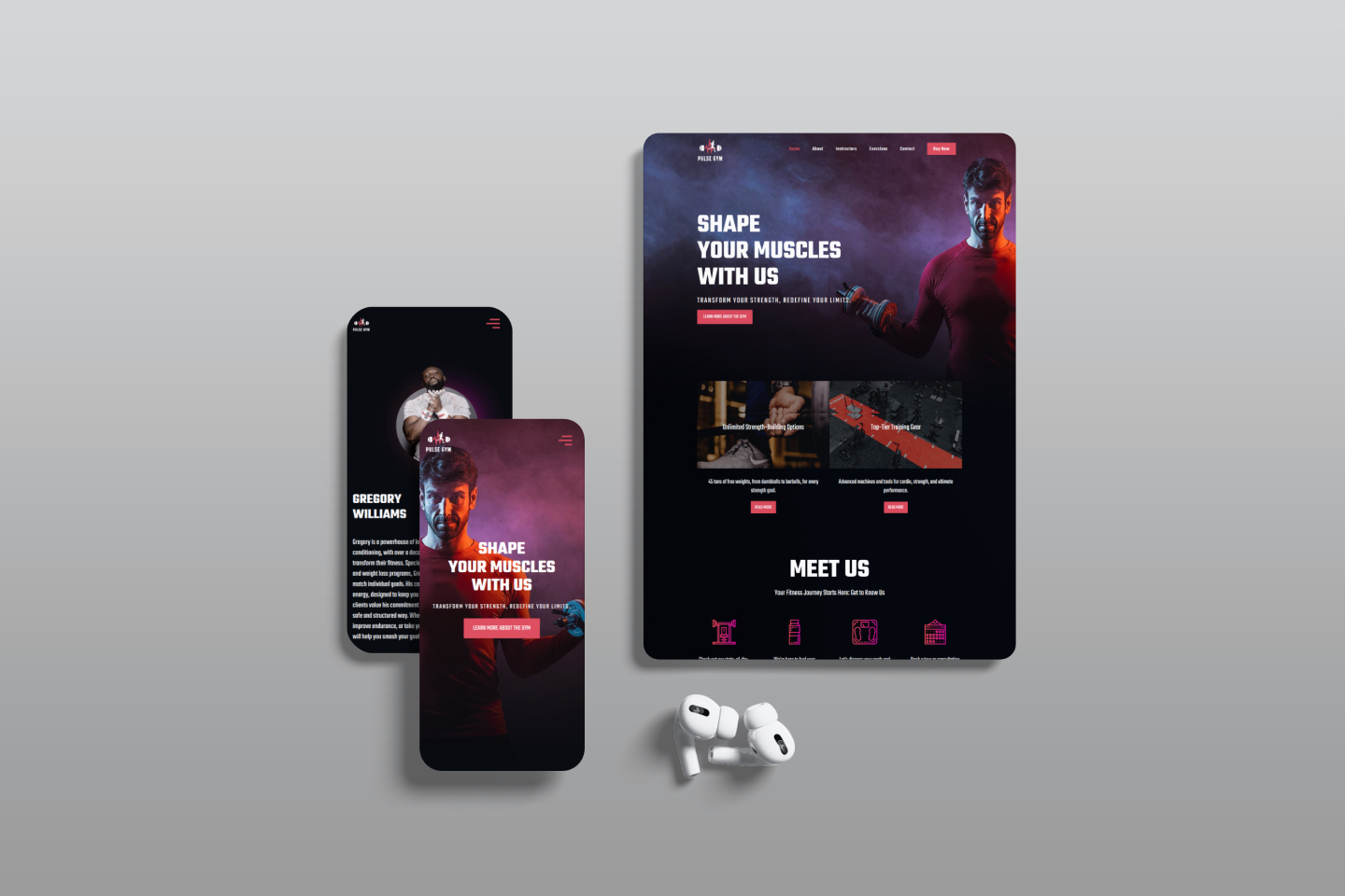
I was brought in as a freelance developer to completely redesign and rebuild the website from the ground up. The goal was to modernize the brand’s online presence, drive new signups, make the site mobile-friendly, and empower the client to manage content on their own moving forward.
The site was rebuilt using 11ty (Eleventy) for static performance, Tailwind CSS + daisyUI for styling, and Decap CMS to allow non-technical content management. I led every aspect of the build — from layout and animations to CMS configuration and performance optimization.

Key contributions included:
- Complete Page Development: Designed and implemented all core pages — including Homepage (with CTA-rich hero), Features, About, Trainers, Pricing Plans, and Contact.
- Brand-Driven UI Execution: Used a bold black base with hot pink and red accents to give the site a high-impact, motivational tone. All-caps condensed typography helped deliver an intense, no-nonsense message.
- CMS Configuration with Decap: Built flexible content collections for trainers, pricing plans, and feature blocks. The client can now manage team bios, images, and pricing updates directly from the CMS.
- Modular, Symmetrical Layouts: Applied a strict grid system with alternating color blocks to create visual rhythm and clarity across all sections — especially effective in presenting features and pricing tiers.
- Performance & Accessibility: Optimized images using
sharpand WebP, applied lazy loading and semantic markup, and ensured ARIA roles and keyboard navigation support — all resulting in strong Lighthouse scores. - Custom Animations: Implemented micro-animations and hover effects to enhance interactivity without compromising performance, using Tailwind transitions and minimal JS.
While the site is currently hosted as a live demo for portfolio continuity, the design and structure are fully client-ready. Feedback from test users and collaborators has been overwhelmingly positive, praising the “club-meets-training-ground” aesthetic and the ease of use across devices. The project is a strong demonstration of my ability to merge brand identity with modern frontend best practices in a highly structured, editable environment.