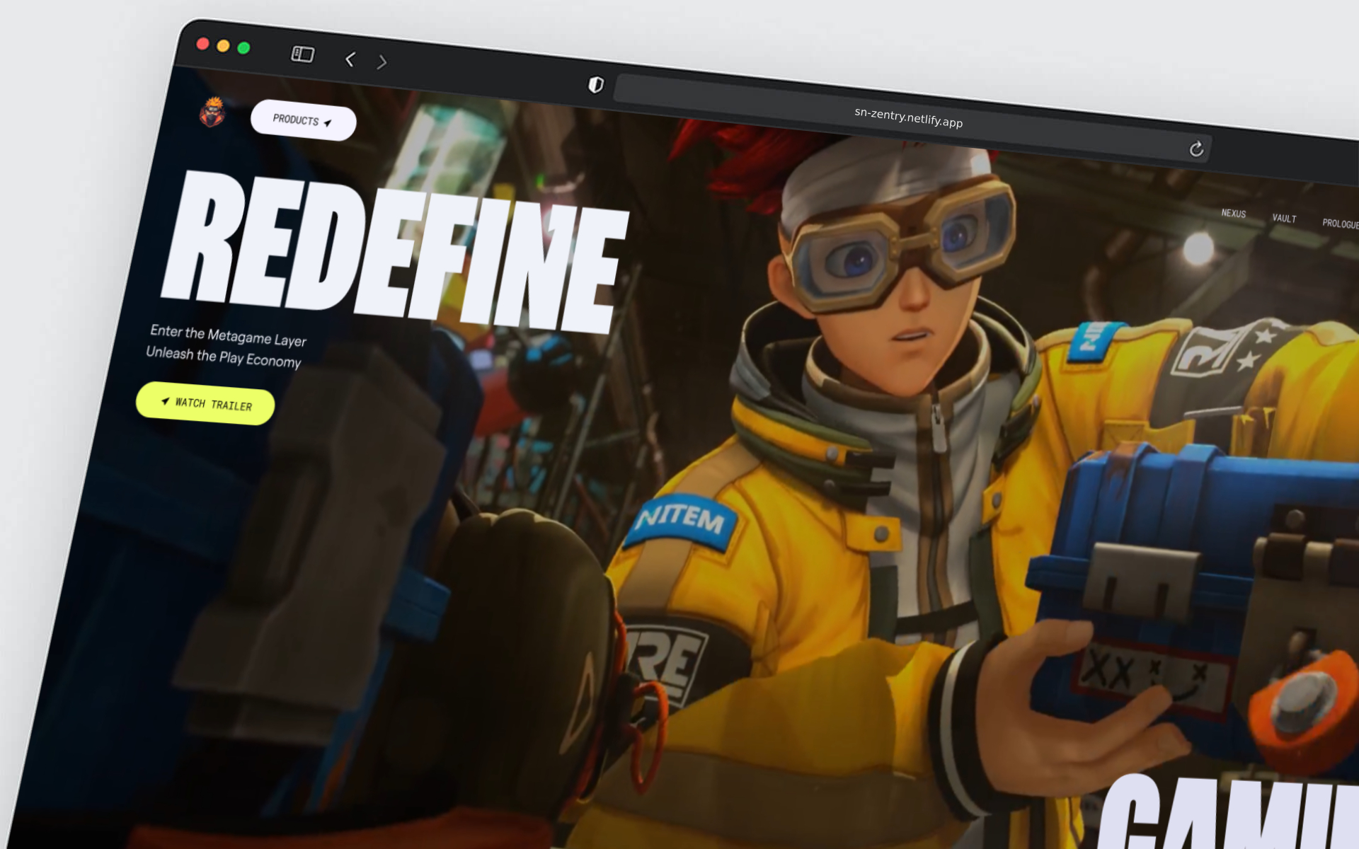
My objective was to build a fully responsive web experience that featured advanced scroll-triggered animations, geometric transitions, and seamless video integration — closely mimicking the original design while developing reusable components and scalable structure.
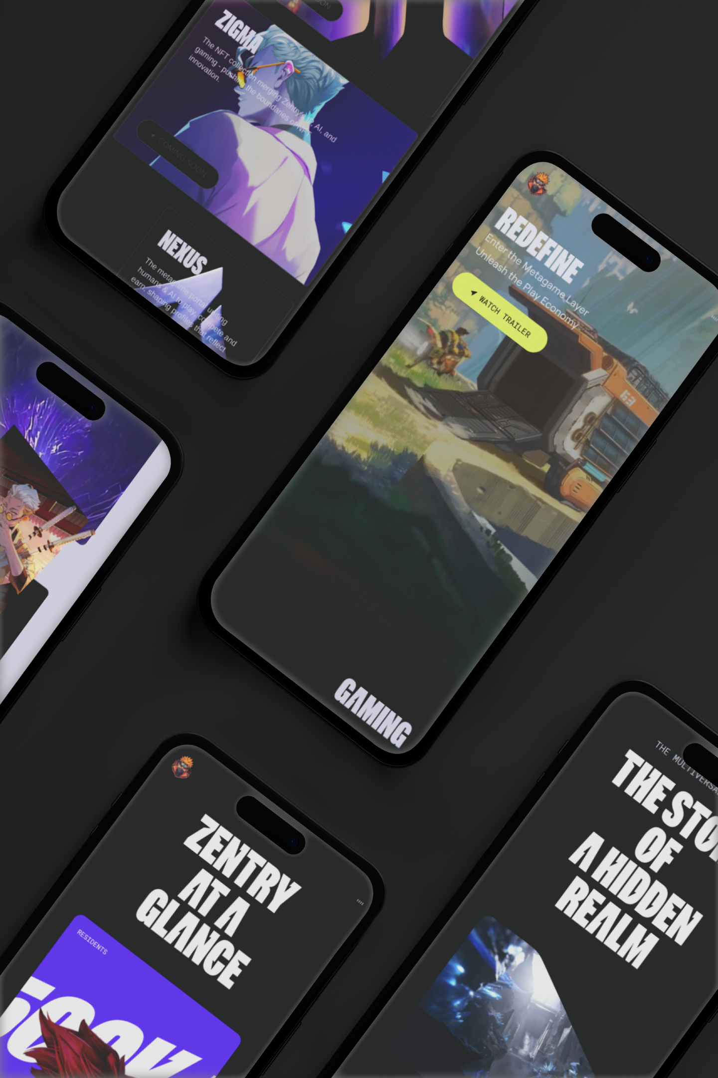
I developed the project using Vite for fast builds, React with modular components, and Tailwind CSS for efficient styling using the OKLCH color model. For animations, I used GSAP with ScrollTrigger to animate elements on scroll and clip-path transitions. One of the main challenges was getting video playback to behave correctly on mobile devices without breaking the layout. I solved this by using the playsInline attribute and conditionally serving mobile-optimized video files. All animations were refined through careful experimentation and close reading of GSAP documentation.
The result is a responsive, scroll-animated site that runs smoothly across devices. Despite using multiple animations and embedded videos, the project maintains a 96% performance score on Lighthouse, with potential for even higher optimization if needed. Beyond refining my GSAP skillset, the project serves as a strong showcase piece for employers, highlighting both design sensitivity and frontend engineering skills.